Selected Frame Overview

Project Overview
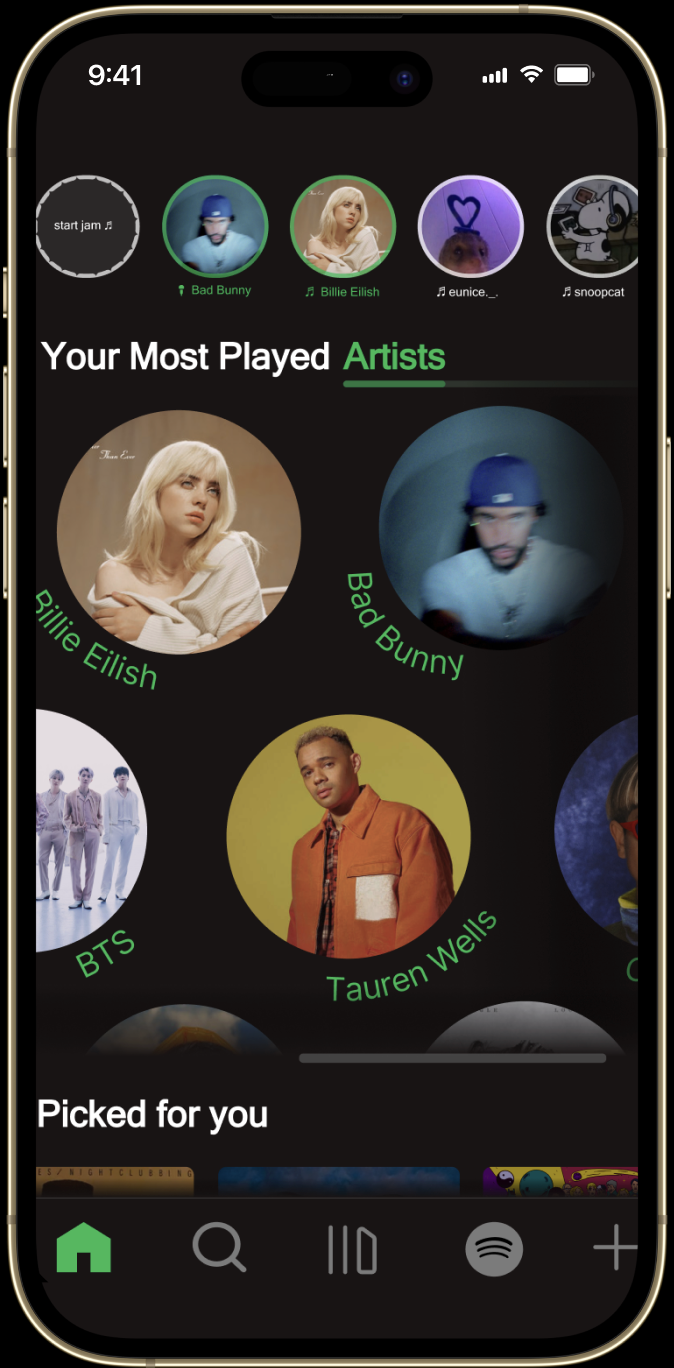
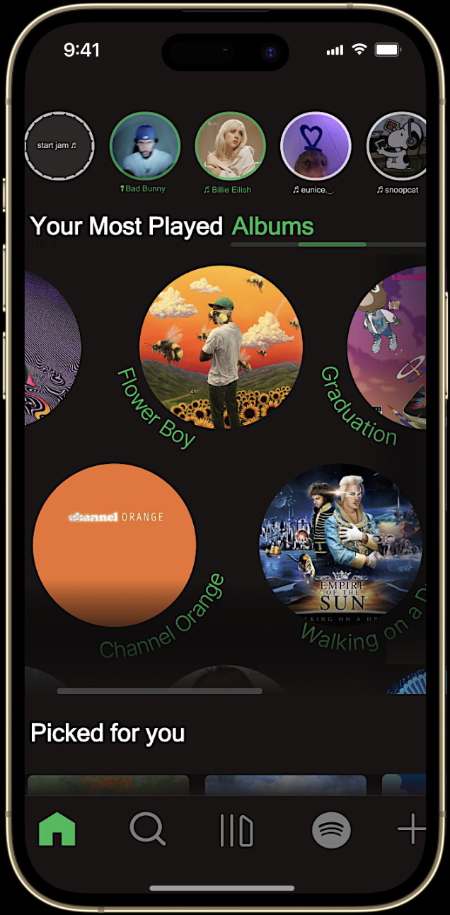
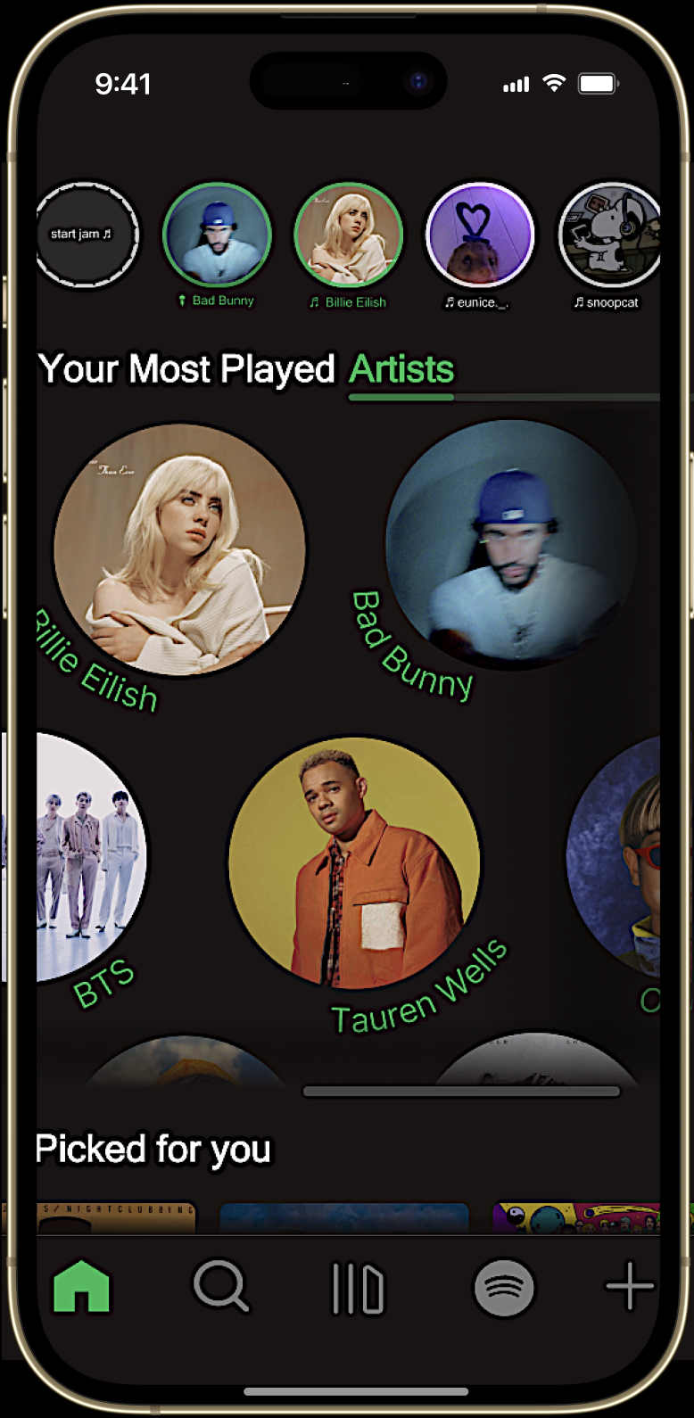
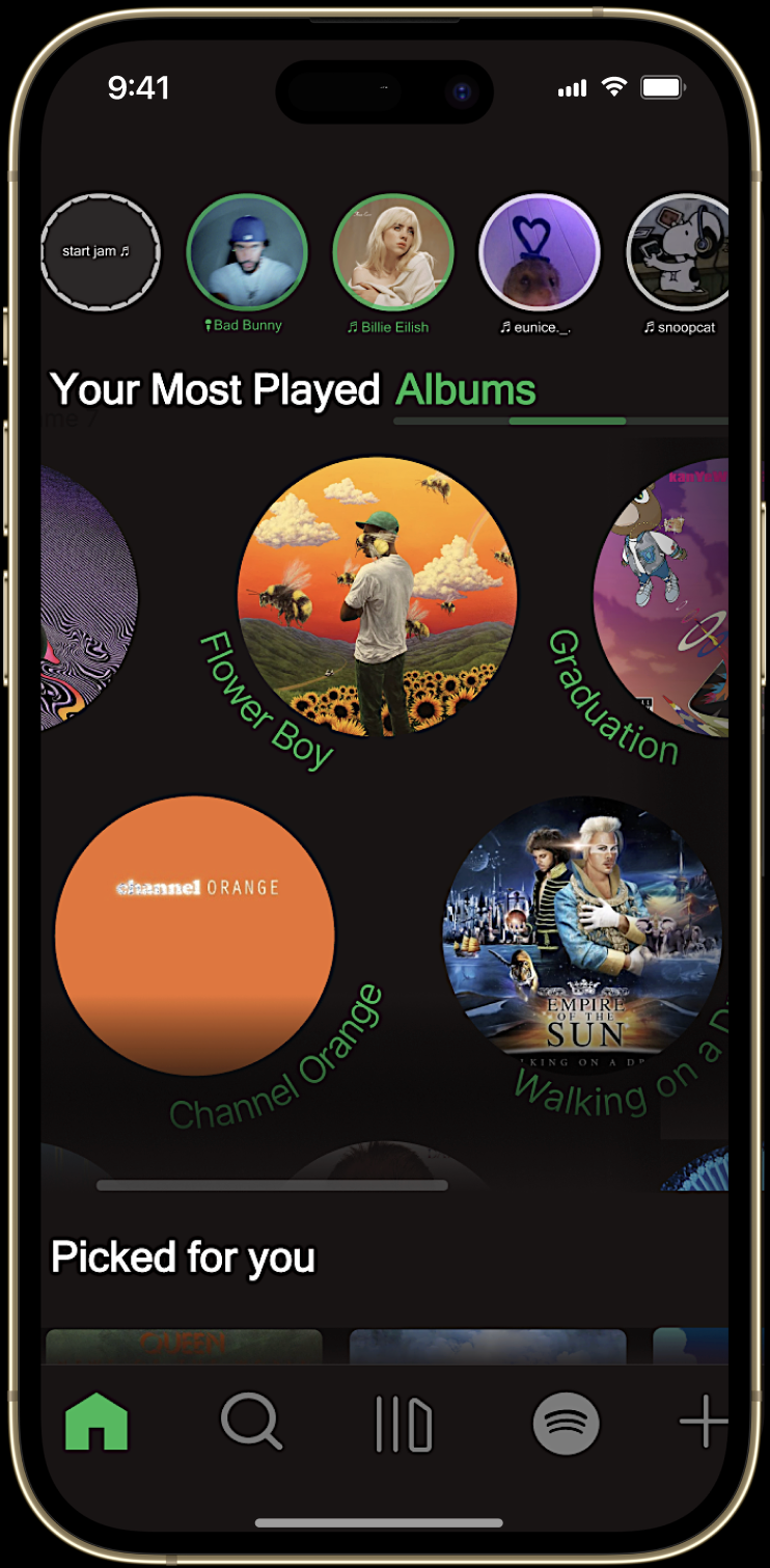
The “Your Most Played Albums” screen extends the structure and flow of the Artists layout to maintain visual and functional consistency. Each album is presented in a clean, scrollable system that mirrors the artist interface, allowing users to move seamlessly between sections without cognitive friction.
Albums are organized in a continuous horizontal scroller, emphasizing rhythm and discoverability. This design supports the same circular, story-like structure used for artists, connecting each album to its corresponding creator while preserving hierarchy and visual harmony. Motion and spacing are carefully balanced to create a sense of flow, making exploration feel effortless.
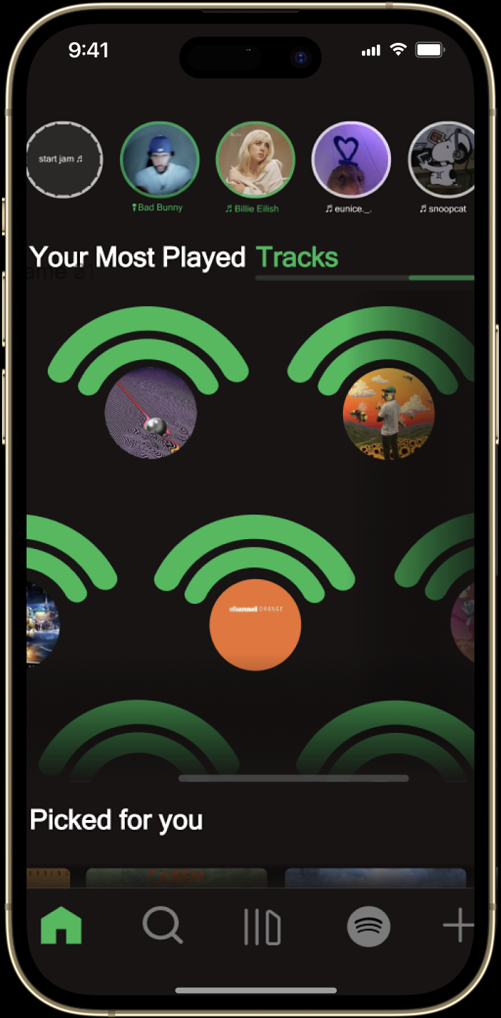
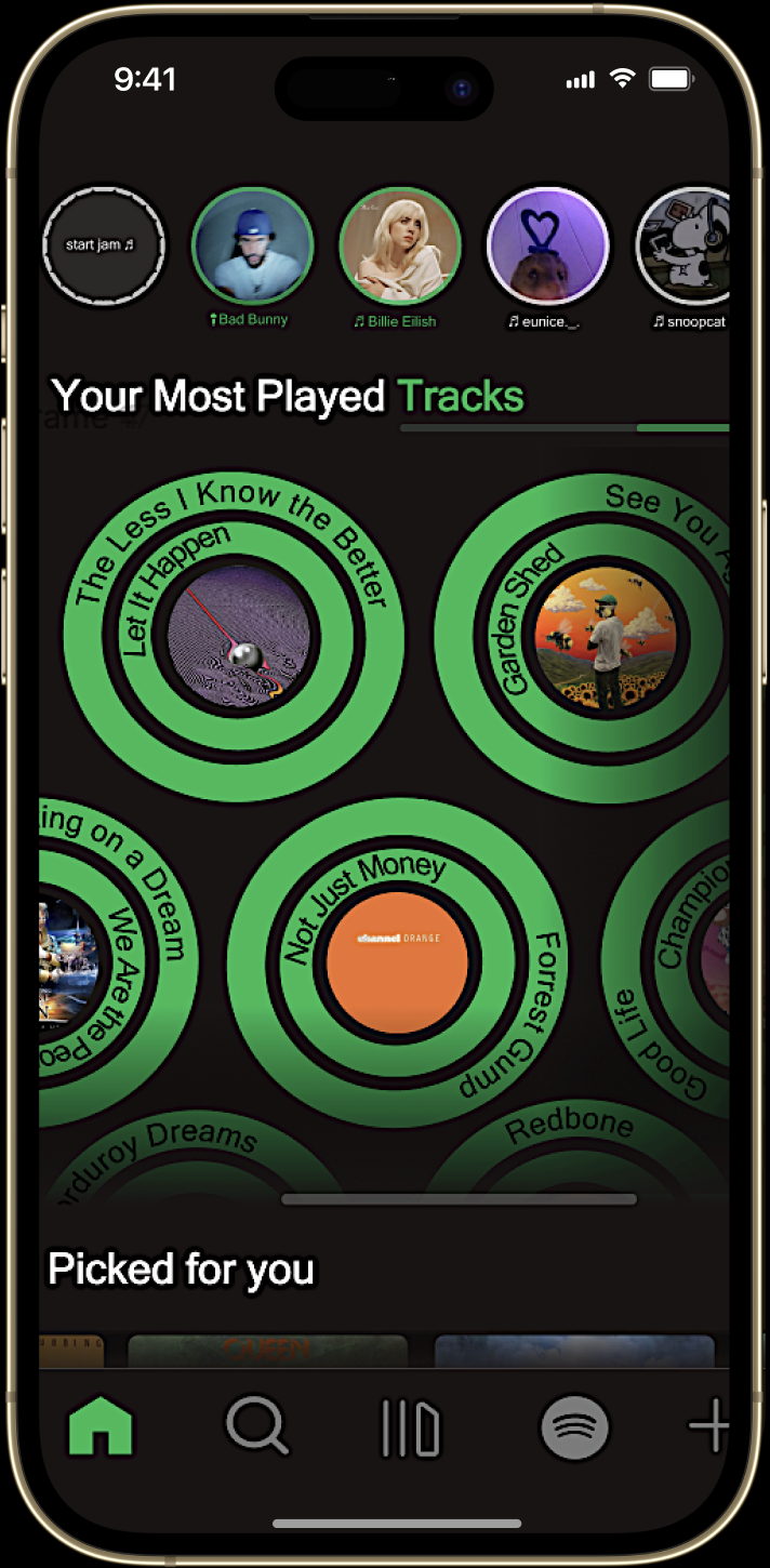
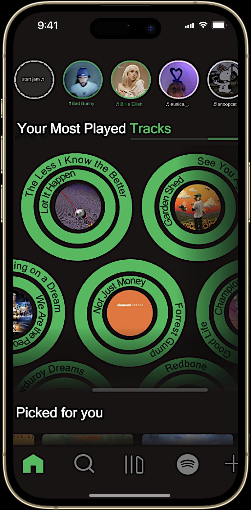
This section completes the system by surfacing the top two tracks from each artist as the final point in the flow. The structure mirrors the Artists and Albums views, keeping navigation consistent and intuitive. Each artist is paired with its album in a subtle record-style motif, where the Spotify mark expands into concentric rings around the cover to reinforce identity and playback state. The result is a cohesive, continuous experience that highlights frequency, context, and effortless reentry to the music users play most.
This project reimagines the Spotify mobile experience with a focus on clarity, consistency, and meaningful interaction. The objective was to create a more organized, intuitive interface while preserving the brand’s identity and energy. I began by addressing one of Spotify’s biggest usability challenges: fragmented navigation. The home experience now uses a single horizontal scroller to group related sections (Most Played Tracks, Artists, and Albums) so users can explore everything in one continuous flow. This layout improves affordance by clearly signaling that content can be swiped through, while keeping feedback immediate and visual through smooth transitions and micro-animations.
To reinforce brand continuity, circular elements inspired by the Spotify logo appear in motion and functional details, connecting branding with interaction. Simplified icons and a consistent hierarchy guide attention while minimizing cognitive load. Social features such as live performance stories and collaborative jam sessions transform listening into a shared, interactive experience. Hover on any frame for detailed insight into each page.
Selected Frame Overview
Project Overview
The “Your Most Played Albums” screen extends the structure and flow of the Artists layout to maintain visual and functional consistency. Each album is presented in a clean, scrollable system that mirrors the artist interface, allowing users to move seamlessly between sections without cognitive friction.
Albums are organized in a continuous horizontal scroller, emphasizing rhythm and discoverability. This design supports the same circular, story-like structure used for artists, connecting each album to its corresponding creator while preserving hierarchy and visual harmony. Motion and spacing are carefully balanced to create a sense of flow, making exploration feel effortless.
This section completes the system by surfacing the top two tracks from each artist as the final point in the flow. The structure mirrors the Artists and Albums views, keeping navigation consistent and intuitive. Each artist is paired with its album in a subtle record-style motif, where the Spotify mark expands into concentric rings around the cover to reinforce identity and playback state. The result is a cohesive, continuous experience that highlights frequency, context, and effortless reentry to the music users play most.
This project reimagines Spotify’s mobile experience with a focus on clarity, consistency, and meaningful interaction, making the interface easier to navigate while preserving the brand’s energy. I addressed fragmented navigation by consolidating the Home experience into a single horizontal scroller that groups key sections (Most Played Tracks, Artists, Albums) into one continuous flow. Clear swipe affordance, smooth transitions, and micro-interactions keep feedback immediate and intuitive.
Brand continuity is reinforced through circular motion cues inspired by Spotify’s logo, alongside simplified icons and a consistent hierarchy that reduces cognitive load. Social features like live performance stories and collaborative jam sessions make listening feel more shared and interactive. Hover on any frame for details.
Selected Frame Overview
Project Overview
This project reimagines the Spotify mobile experience with a focus on clarity, consistency, and meaningful interaction. The objective was to create a more organized, intuitive interface while preserving the brand’s identity and energy. I began by addressing one of Spotify’s biggest usability challenges: fragmented navigation. The home experience now uses a single horizontal scroller to group related sections (Most Played Tracks, Artists, and Albums) so users can explore everything in one continuous flow. This layout improves affordance by clearly signaling that content can be swiped through, while keeping feedback immediate and visual through smooth transitions and micro-animations.
To reinforce brand continuity, circular elements inspired by the Spotify logo appear in motion and functional details, connecting branding with interaction. Simplified icons and a consistent hierarchy guide attention while minimizing cognitive load. Social features such as live performance stories and collaborative jam sessions transform listening into a shared, interactive experience. Hover on any frame for detailed insight into each page.
The “Your Most Played Albums” screen extends the structure and flow of the Artists layout to maintain visual and functional consistency. Each album is presented in a clean, scrollable system that mirrors the artist interface, allowing users to move seamlessly between sections without cognitive friction.
Albums are organized in a continuous horizontal scroller, emphasizing rhythm and discoverability. This design supports the same circular, story-like structure used for artists, connecting each album to its corresponding creator while preserving hierarchy and visual harmony. Motion and spacing are carefully balanced to create a sense of flow, making exploration feel effortless.
This section completes the system by surfacing the top two tracks from each artist as the final point in the flow. The structure mirrors the Artists and Albums views, keeping navigation consistent and intuitive. Each artist is paired with its album in a subtle record-style motif, where the Spotify mark expands into concentric rings around the cover to reinforce identity and playback state. The result is a cohesive, continuous experience that highlights frequency, context, and effortless reentry to the music users play most.
Selected Frame Overview
Project Overview
This project reimagines the Spotify mobile experience with a focus on clarity, consistency, and meaningful interaction. The objective was to create a more organized, intuitive interface while preserving the brand’s identity and energy. I began by addressing one of Spotify’s biggest usability challenges: fragmented navigation. The home experience now uses a single horizontal scroller to group related sections (Most Played Tracks, Artists, and Albums) so users can explore everything in one continuous flow. This layout improves affordance by clearly signaling that content can be swiped through, while keeping feedback immediate and visual through smooth transitions and micro-animations. To reinforce brand continuity, circular elements inspired by the Spotify logo appear in motion and functional details, connecting branding with interaction. Simplified icons and a consistent hierarchy guide attention while minimizing cognitive load. Social features such as live performance stories and collaborative jam sessions transform listening into a shared, interactive experience. Hover on any frame for detailed insight into each page.
The “Your Most Played Albums” screen extends the structure and flow of the Artists layout to maintain visual and functional consistency. Each album is presented in a clean, scrollable system that mirrors the artist interface, allowing users to move seamlessly between sections without cognitive friction.
Albums are organized in a continuous horizontal scroller, emphasizing rhythm and discoverability. This design supports the same circular, story-like structure used for artists, connecting each album to its corresponding creator while preserving hierarchy and visual harmony. Motion and spacing are carefully balanced to create a sense of flow, making exploration feel effortless.
This section completes the system by surfacing the top two tracks from each artist as the final point in the flow. The structure mirrors the Artists and Albums views, keeping navigation consistent and intuitive. Each artist is paired with its album in a subtle record-style motif, where the Spotify mark expands into concentric rings around the cover to reinforce identity and playback state. The result is a cohesive, continuous experience that highlights frequency, context, and effortless reentry to the music users play most.
This project reimagines the Spotify mobile experience with a focus on clarity, consistency, and meaningful interaction. The objective was to create a more organized, intuitive interface while preserving the brand’s identity and energy.
I began by addressing one of Spotify’s biggest usability challenges: fragmented navigation. The home experience now uses a single horizontal scroller to group related sections (Most Played Tracks, Artists, and Albums) so users can explore everything in one continuous flow. This layout improves affordance by clearly signaling that content can be swiped through, while keeping feedback immediate and visual through smooth transitions and micro-animations.
To reinforce brand continuity, circular elements inspired by the Spotify logo appear in motion and functional details, connecting branding with interaction. Simplified icons and a consistent hierarchy guide attention while minimizing cognitive load. Social features such as live performance stories and collaborative jam sessions transform listening into a shared, interactive experience.
The “Your Most Played Albums” screen extends the structure and flow of the Artists layout to maintain visual and functional consistency. Each album is presented in a clean, scrollable system that mirrors the artist interface, allowing users to move seamlessly between sections without cognitive friction.
Albums are organized in a continuous horizontal scroller, emphasizing rhythm and discoverability. This design supports the same circular, story-like structure used for artists, connecting each album to its corresponding creator while preserving hierarchy and visual harmony. Motion and spacing are carefully balanced to create a sense of flow, making exploration feel effortless.
This section completes the system by surfacing the top two tracks from each artist as the final point in the flow. The structure mirrors the Artists and Albums views, keeping navigation consistent and intuitive. Each artist is paired with its album in a subtle record-style motif, where the Spotify mark expands into concentric rings around the cover to reinforce identity and playback state. The result is a cohesive, continuous experience that highlights frequency, context, and effortless reentry to the music users play most.
Selected Frame Overview
Project Overview
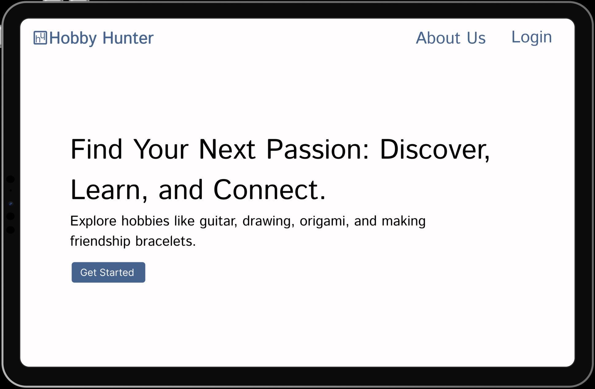
The homepage gives users a simple way to start using HobbyHunters. It includes clear options for Get Started, Login, and About Us so users can easily navigate the app. The design encourages connection through shared hobbies while keeping the experience organized and easy to use. The goal is to help users meet friends or new peers, explore hobbies they enjoy, and build skills in a positive, balanced environment.
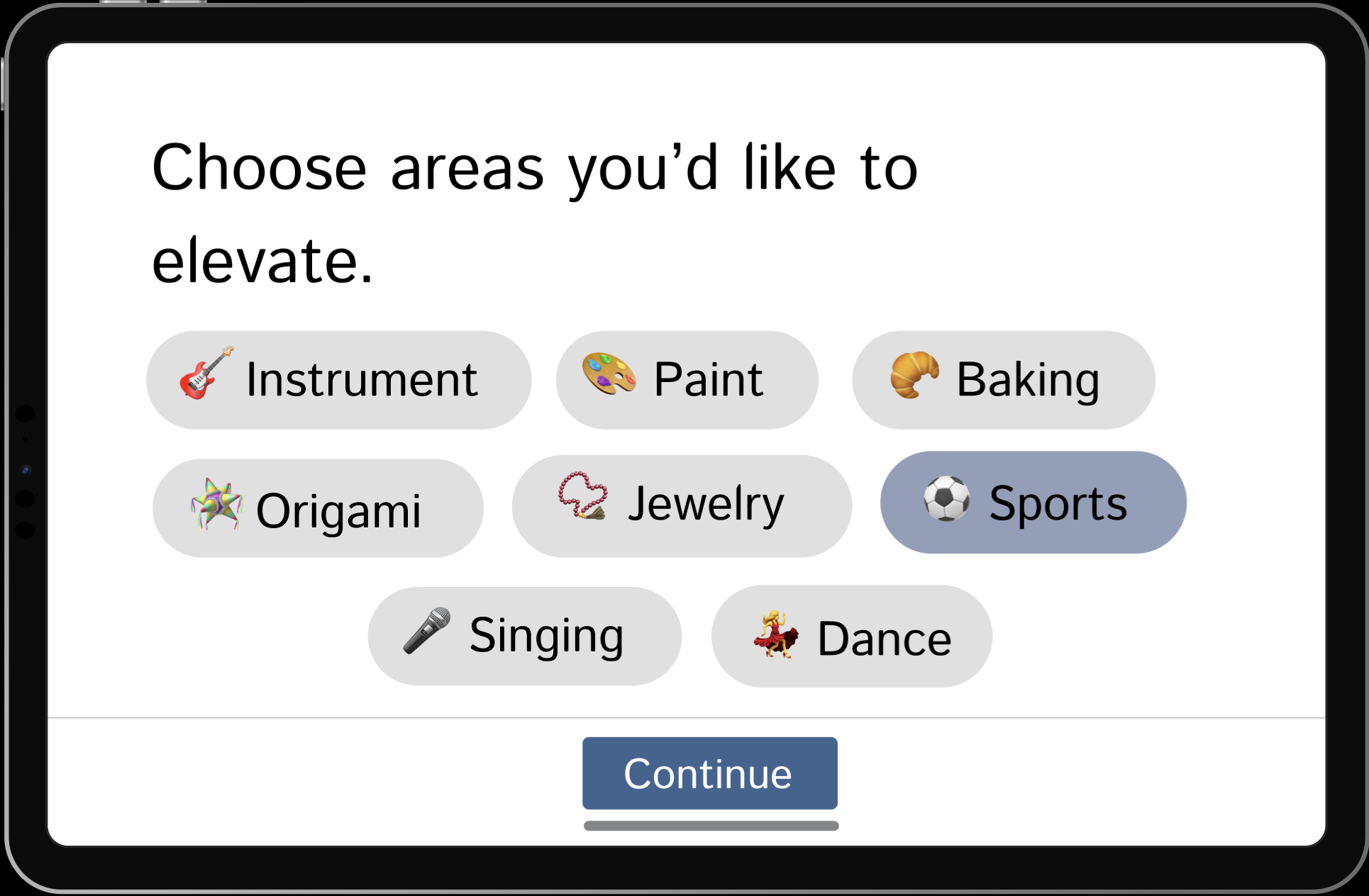
This page lets users select the hobbies and skills they want to focus on. The layout is inspired by Pinterest’s interest-selection interface, allowing for quick, visual choices that personalize the app experience. It shows how HobbyHunters incorporates proven design patterns from other social platforms to make setup familiar, engaging, and easy to use.
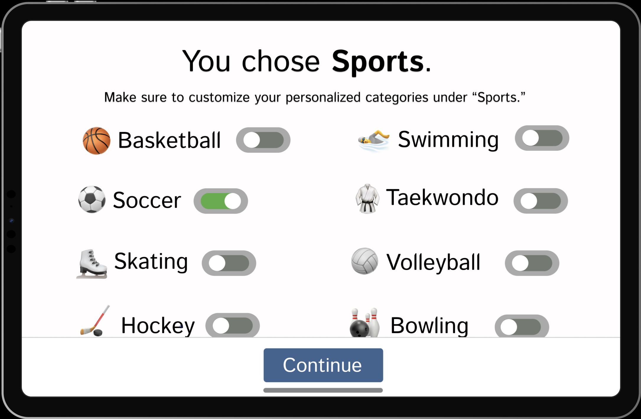
After choosing general areas to develop, users can refine their experience by selecting specific interests within each category. For example, selecting Sports allows users to pick particular activities like basketball, tennis, or swimming. This step personalizes the app further, helping HobbyHunters recommend more rezlevant activities, tutorials, and connections based on the user’s preferences.
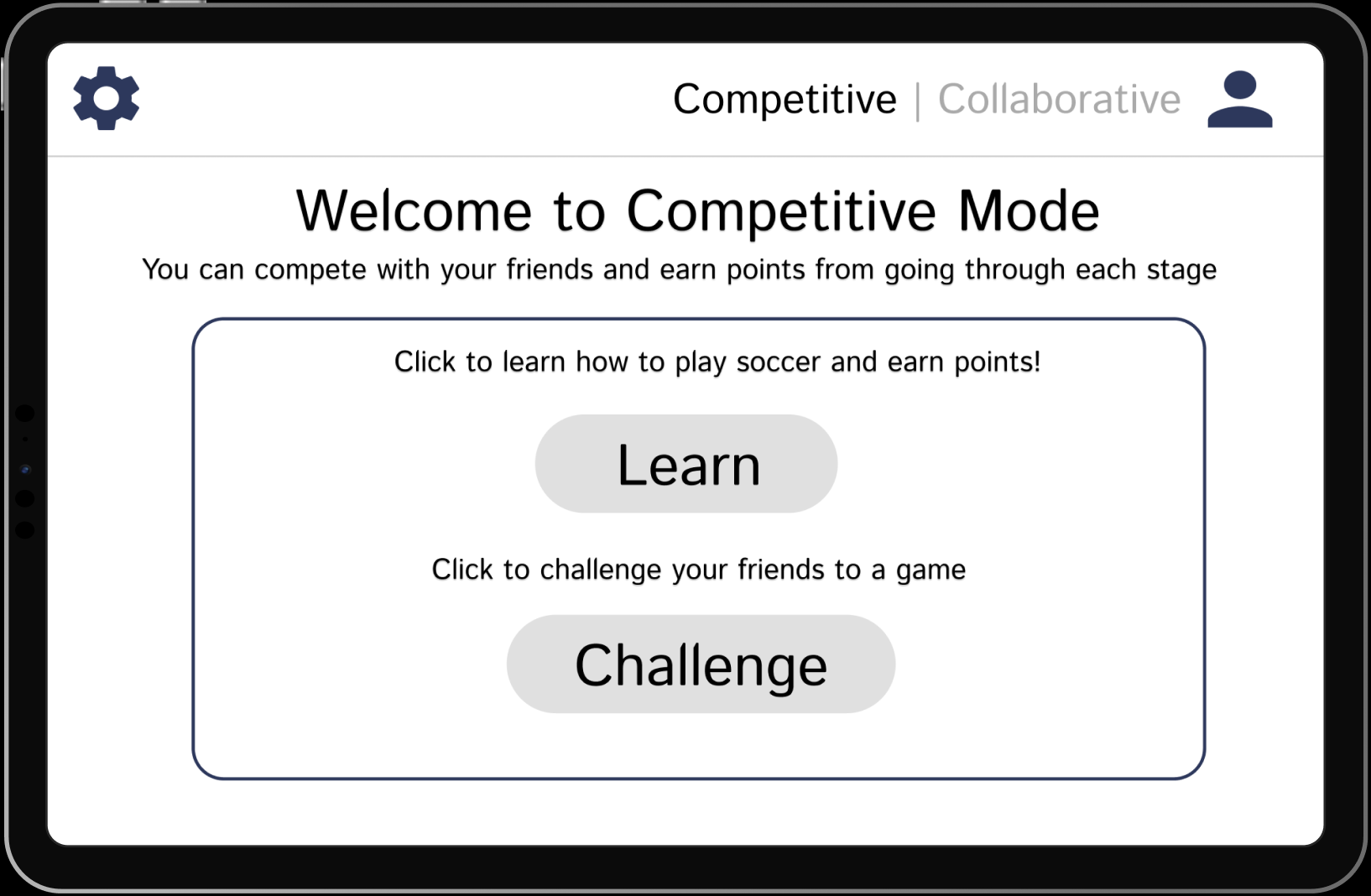
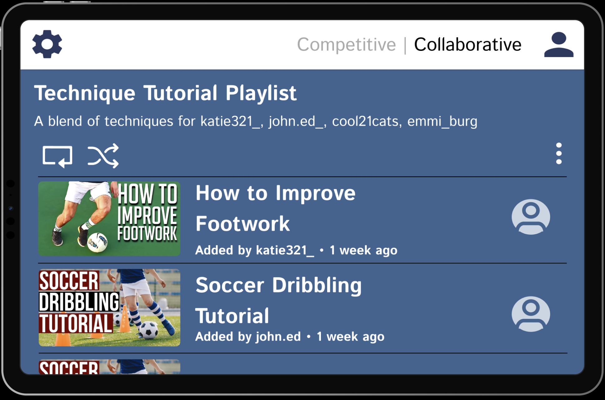
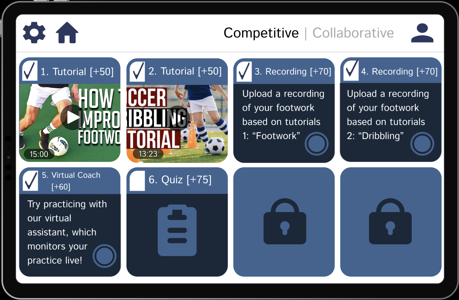
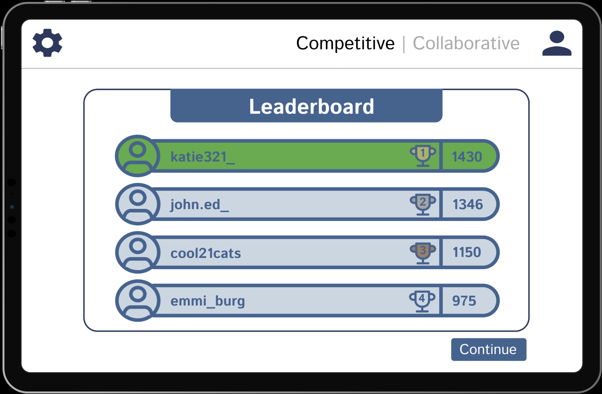
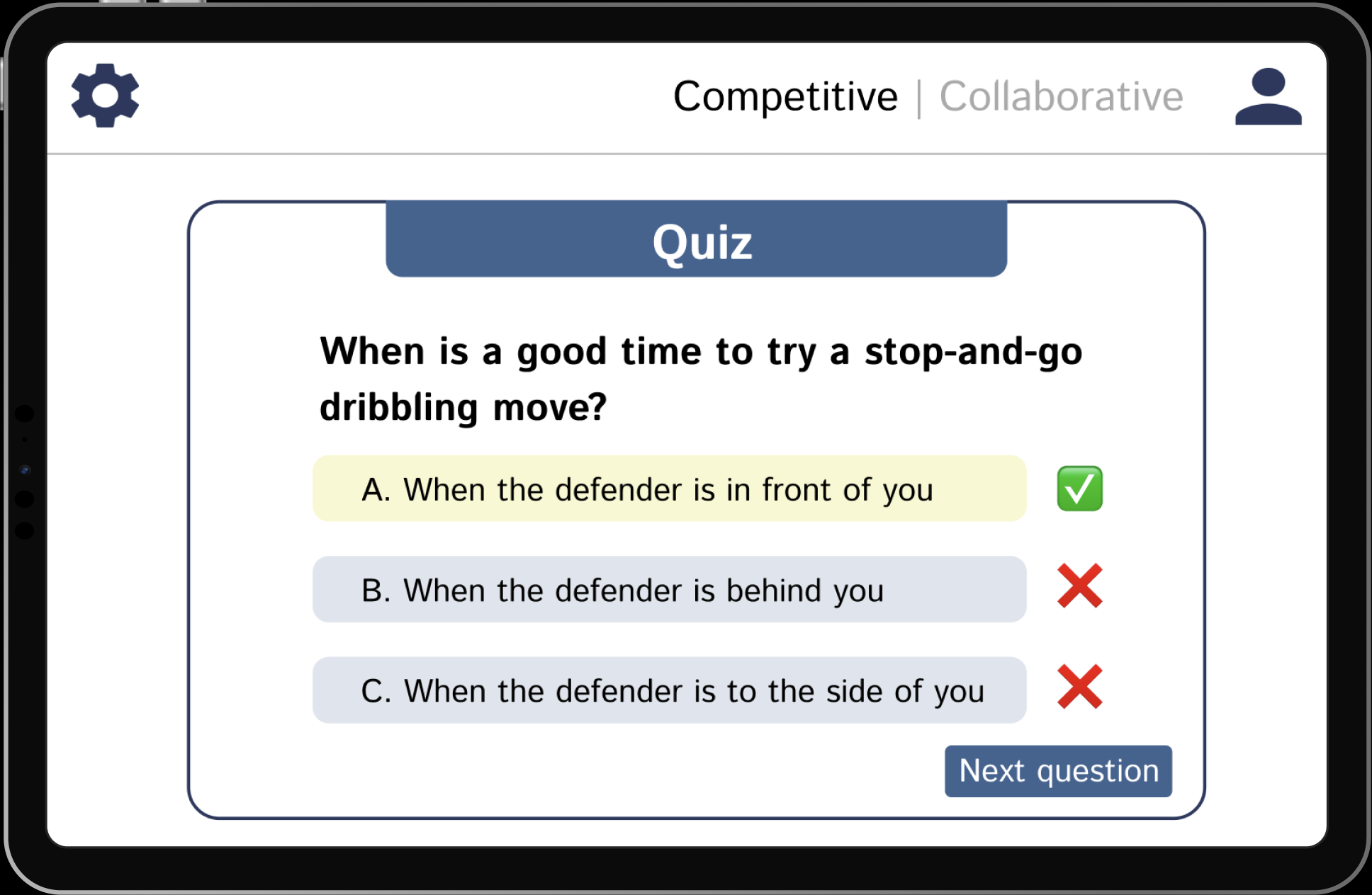
HobbyHunters is a social skill-building app created as a design research project at Cornell by my team and me. It is designed for young adults who want to grow personally while staying connected with others. The app combines the best elements of learning and social interaction through two modes: collaborative, where users work in hobby-based groups to complete tutorials and challenges, and competitive, where they track progress on leaderboards with friends. These features work to create an all-in-one social experience that promotes growth, creativity, and community. Hover on any frame for details, or scroll → for all frames.
Selected Frame Overview
Project Overview
HobbyHunters is a social skill-building app created as a design research project at Cornell by my team and me. It is designed for young adults who want to grow personally while staying connected with others. The app combines the best elements of learning and social interaction through two modes: collaborative, where users work in hobby-based groups to complete tutorials and challenges, and competitive, where they track progress on leaderboards with friends. These features work to create an all-in-one social experience that promotes growth, creativity, and community. Hover on any frame for details, or scroll → for all frames.
The homepage gives users a simple way to start using HobbyHunters. It includes clear options for Get Started, Login, and About Us so users can easily navigate the app. The design encourages connection through shared hobbies while keeping the experience organized and easy to use. The goal is to help users meet friends or new peers, explore hobbies they enjoy, and build skills in a positive, balanced environment.
This page lets users select the hobbies and skills they want to focus on. The layout is inspired by Pinterest’s interest-selection interface, allowing for quick, visual choices that personalize the app experience. It shows how HobbyHunters incorporates proven design patterns from other social platforms to make setup familiar, engaging, and easy to use.
After choosing general areas to develop, users can refine their experience by selecting specific interests within each category. For example, selecting Sports allows users to pick particular activities like basketball, tennis, or swimming. This step personalizes the app further, helping HobbyHunters recommend more rezlevant activities, tutorials, and connections based on the user’s preferences.
Selected Frame Overview
Project Overview
HobbyHunters is a social skill-building app created as a design research project at Cornell by my team and me. It is designed for young adults who want to grow personally while staying connected with others. The app combines the best elements of learning and social interaction through two modes: collaborative, where users work in hobby-based groups to complete tutorials and challenges, and competitive, where they track progress on leaderboards with friends. These features work to create an all-in-one social experience that promotes growth, creativity, and community. Hover on any frame for detailed insight, or scroll → to see more frames.
The homepage gives users a simple way to start using HobbyHunters. It includes clear options for Get Started, Login, and About Us so users can easily navigate the app. The design encourages connection through shared hobbies while keeping the experience organized and easy to use. The goal is to help users meet friends or new peers, explore hobbies they enjoy, and build skills in a positive, balanced environment.
This page lets users select the hobbies and skills they want to focus on. The layout is inspired by Pinterest’s interest-selection interface, allowing for quick, visual choices that personalize the app experience. It shows how HobbyHunters incorporates proven design patterns from other social platforms to make setup familiar, engaging, and easy to use.
After choosing general areas to develop, users can refine their experience by selecting specific interests within each category. For example, selecting Sports allows users to pick particular activities like basketball, tennis, or swimming. This step personalizes the app further, helping HobbyHunters recommend more relevant activities, tutorials, and connections based on the user’s preferences.
HobbyHunters is a social skill-building app created as a design research project at Cornell by my team and me. It is designed for young adults who want to grow personally while staying connected with others. The app combines the best elements of learning and social interaction through two modes: collaborative, where users work in hobby-based groups to complete tutorials and challenges, and competitive, where they track progress on leaderboards with friends. These features work to create an all-in-one social experience that promotes growth, creativity, and community. Scroll → to see more frames.
The homepage gives users a simple way to start using HobbyHunters. It includes clear options for Get Started, Login, and About Us so users can easily navigate the app. The design encourages connection through shared hobbies while keeping the experience organized and easy to use. The goal is to help users meet friends or new peers, explore hobbies they enjoy, and build skills in a positive, balanced environment.
This page lets users select the hobbies and skills they want to focus on. The layout is inspired by Pinterest’s interest-selection interface, allowing for quick, visual choices that personalize the app experience. It shows how HobbyHunters incorporates proven design patterns from other social platforms to make setup familiar, engaging, and easy to use.
After choosing general areas to develop, users can refine their experience by selecting specific interests within each category. For example, selecting Sports allows users to pick particular activities like basketball, tennis, or swimming. This step personalizes the app further, helping HobbyHunters recommend more relevant activities, tutorials, and connections based on the user’s preferences.
Selected Frame Overview
Project Overview
HobbyHunters is a social skill-building app created as a design research project at Cornell by my team and me. It is designed for young adults who want to grow personally while staying connected with others. The app combines the best elements of learning and social interaction through two modes: collaborative, where users work in hobby-based groups to complete tutorials and challenges, and competitive, where they track progress on leaderboards with friends. These features work to create an all-in-one social experience that promotes growth, creativity, and community. Hover on any frame for detailed insight, or scroll → to see more frames.
The homepage gives users a simple way to start using HobbyHunters. It includes clear options for Get Started, Login, and About Us so users can easily navigate the app. The design encourages connection through shared hobbies while keeping the experience organized and easy to use. The goal is to help users meet friends or new peers, explore hobbies they enjoy, and build skills in a positive, balanced environment.
This page lets users select the hobbies and skills they want to focus on. The layout is inspired by Pinterest’s interest-selection interface, allowing for quick, visual choices that personalize the app experience. It shows how HobbyHunters incorporates proven design patterns from other social platforms to make setup familiar, engaging, and easy to use.
After choosing general areas to develop, users can refine their experience by selecting specific interests within each category. For example, selecting Sports allows users to pick particular activities like basketball, tennis, or swimming. This step personalizes the app further, helping HobbyHunters recommend more relevant activities, tutorials, and connections based on the user’s preferences.


.svg)

.svg)